Here’s the usual post-mortem run-down for Ludum Dare 32: Lightbender. I usually do “What Went Right” and “What Went Wrong,” but there are elements of both in most of these categories.
Setup
Initially I planned on working with Mike for my first team jam. I had mixed feelings–while I’d like to see what a team could produce, Mike wanted to work in 3D. I have no Blender experience and feel my 2D skills are very strong, so I was uncertain. Ultimately, Mike got sick and I did the solo compo.
I was also relatively unprepared. The week before the jam was a crunch at my day job. I didn’t know how late I’d be working on Friday evening to get a testing release out to the client before Monday. I didn’t know if I’d even be in mental shape to be productive. Luckily I wrapped up a little after 6, had some extra time for a long dinner to clear my head, and was ready to go by the time the theme was announced at 9.
Jam Theme
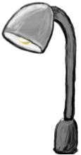 “An Unconventional Weapon” isn’t an overly restrictive theme, but it’s also tough to come up with something original. I left the Friday night meetup at the TechCo empty, staring at everything and hoping to come up with a concept. Driving home at night, the best I could come up with was manipulating streetlights.
Honestly, I wish I could have come up with a theme that subverted the usual video game tropes. De-escalating a situation non-violently and making allies out of enemies rather than escalating everything would truly be an unconventional weapon, while making an important point in the process.
Art / Microsoft Surface
I recently bought a Surface Pro 2 marked down after the Surface Pro 3’s release, mainly because I’d been interested in one as a drawing tablet. (Surface Pro 1’s and 2’s use Wacom Feel for pressure sensitivity and some other handy graphics tablet features.)
I feel like the touch screen makes me more productive than my Bamboo Fun. It’s not a massive improvement; swapping between coding and art by changing devices is just easier than dragging out a separate tablet. And since I was already using Bitbucket, pushing changes between devices was easy.
Unity 5
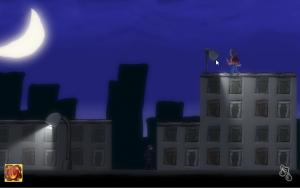 Knowing that my game concept would be lighting-heavy, I dug into Unity’s graphics features a bit more. I don’t know if Bloom was previously a pro feature or not, but it made a huge difference. With just a little tweaking, there was a huge difference in quality. It enhanced the contrast I was already building in to the art and lighting.
Platforming
Building a platformer is hard. I’ve been tinkering with it since very soon after I learned Unity and it’s always been just out of my reach. It was only a few months back that I started trying to code a platfomer character controller by myself. I’m really happy I was able to get one working from scratch in a weekend–it shows how much I’ve grown since I started doing game jams.
But.
 I still don’t fully understand what I’m building. Sure, I know how to successfully switch between grounded, jumping, and falling states, but making it feel natural and fool-proof is still trial-and-error. I’m stumbling through off-by-one errors and edge cases.
Since I relied on both raycasting in code and Unity colliders, I ran into serious problems getting them lined up. If raycast points were too far from the edge of the colliders, it was possible to never fall off a ledge. If they were too close, it was possible to fly up the edge of a building by holding the jump button.
Often, my first attempt at fixing a problem was to tinker with variables until things worked again. This was part of the reason the force of gravity is so excessive–I’d been trying to fix a problem with floaty falls and revert some of my trial-and-error tweaks. After enough tinkering, it’s very easy to get used to your own weird mechanics.
Post-jam, I did some refactoring that allowed me to build better, more natural jumps. I’ll probably post about that later, because it’s one of the few times I’ve actually used calculus outside of school.
Shaders, Lighting, and Cameras
I’ve only done a little tinkering with lighting, so this weekend was a learning experience. It didn’t help that I was combining normal Unity 2D sprites with 2D Toolkit tiled sprites, and unlit with lit sprites.
Unity’s built-in shaders are confusing if you’re just poking around for the first time–some shaders seemed to ignore sorting order, while others honored it. Trying to find the correct combination of lit vs. unlit and sorted vs. unsorted was trial and error. There were a few times I figured I’d painted myself into a corner and would have to give up.
 That said, I also pulled off some neat camera tricks with minimal difficulty. I didn’t want the UI to be affected by Bloom, so I ended up learning about multiple cameras and camera culling masks. It was far easier than I expected.
Music
The inspiration (if you can call it that) for the music was the Zelda dungeon theme. I wanted something with a driving rhythm, but that didn’t require a lot of complexity. The Zelda dungeon theme does have complexity, but it tends to blend into the repetitive part.
I didn’t end up with any of the complexity, or even the key changes that keep it interesting, but the music came together far more quickly than my last Ludum Dare foray into PxTone.
Thinking Ahead
This happens every Ludum Dare: I randomly take a little time on Friday or Saturday night for impromptu pre-planning, and it ends up paying off far more than I expected. In fact, it usually ends up being critical to the success of the game as a whole.
Friday night, I had proof-of-concept versions of the lighting, damage, and enemy mechanics. This really laid the groundwork for everything, and if I’d stopped work on Friday with any less, I wouldn’t have finished on Sunday.
I stopped working around 3am but I knew it’d be a little while before I got to sleep, so I sketched out three levels (and their associated powers). Again, I wouldn’t have finished with interesting puzzles without it.
Saturday night I dabbled with music, intending to get a baseline to build off of later. I ended up with something that I felt could be used as-is. Again, this was invaluable–I wouldn’t have had time Sunday to do any more work.
If you’re doing a game jam, I’d always suggest taking a few minutes here and there to deliberately tinker with concepts you aren’t ready to start on. It feels backwards–a distraction from your real priorities, “waterfall” instead of “agile”–but it allows you to start thinking about them for real, not just hypothetically.
Character Design
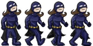 Soon after coming up with the concept, I decided the game was nominally superhero-themed. Without a very strong storyline, I realized the hero was just a generic superhero archetype, and so I might as well make the character female. (I think this was the result of hearing Mike discuss various articles and books on the subject of diversity in games, as well as keeping up with the Tropes vs. Women videos–“male” need not be the default setting.)
I’m far better at drawing male characters, mainly because I’m not a very practiced artist. But I’m also worried about making a novice mistake and getting something painfully, awkwardly, obviously wrong–and in the process coming off as a creepy artist who oversexualizes characters of the opposite gender (I’ve seen a few, what with all the conventions I’ve been to). Oddly, I think that helped–I was afraid of any design choice that would play up the gender of the character. That meant she could be first and foremost a superhero, not just a female character who happens to also be a superhero.
I was quite proud of my standing frame for the hero, but it came so late on Saturday that I had to start cutting corners. I saved frames of animation by rotating and adjusting the head and arms, so I only had to redraw the legs. It was efficient, but I felt like the quality suffered.
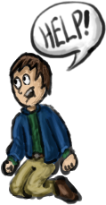 The captives were really just my “default cartoon person,” but I was happy with the mileage I got out of adjusting their facial expressions and position of the help bubble in animation. They felt much richer than they really are.
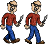 The bad guys I was disappointed with, simply because I felt like I gave up last-minute. They’re poorly animated, lack detail, and are essentially bad cartoon “criminal” stereotypes (see the Beagle Boys from DuckTales for comparison).
Game Concept
As I said, I decided this was a nominally superhero-themed game–it was going to play on the archetype of a superhero fighting crime in the big city, but it didn’t much matter who, where, or why (beyond “superhero with light powers”).
At first, this was helpful–the theme was a very thin layer on top of the mechanics. I didn’t have to explain it, because everyone knows it already. I could focus on the how rather than writing out the why.
At some point on Saturday, I had an odd realization. As I combined all the graphics and particle effects, the morality of this game seemed horribly flimsy–it felt like you were burning people to death with unholy powers for simply being in your way while wearing a stereotypical cartoon criminal mask. Not exactly heroic.
This isn’t unlike my reaction to the violence in BioShock Infinite–I’d already read all the spoilers, but still kept expecting a reveal that your murder spree meant you were the real bad guy. Plus, I tend to be uncomfortable with dualistic worldviews that cleanly divides people into “good guys” and “bad guys” (not because I don’t believe in moral absolutes, but because I do).
Of course, this mirrors some of the discomfort I have with superhero morality in general. And ultimately, I think it was the result of staring at the game too long, not some sort of intrinsic moral failure. It’s not that different from a stereotypical Superman or Batman script (and I think I made the hero’s costume somewhat 60’s Batman-y to make that clear). My reaction was sort of like what happens when you stare at a word so long it stops looking like a word.
